Union
An operations system for Gloucestershire Bundles, a local charity.
In private use · public release Aug/Sept 2026
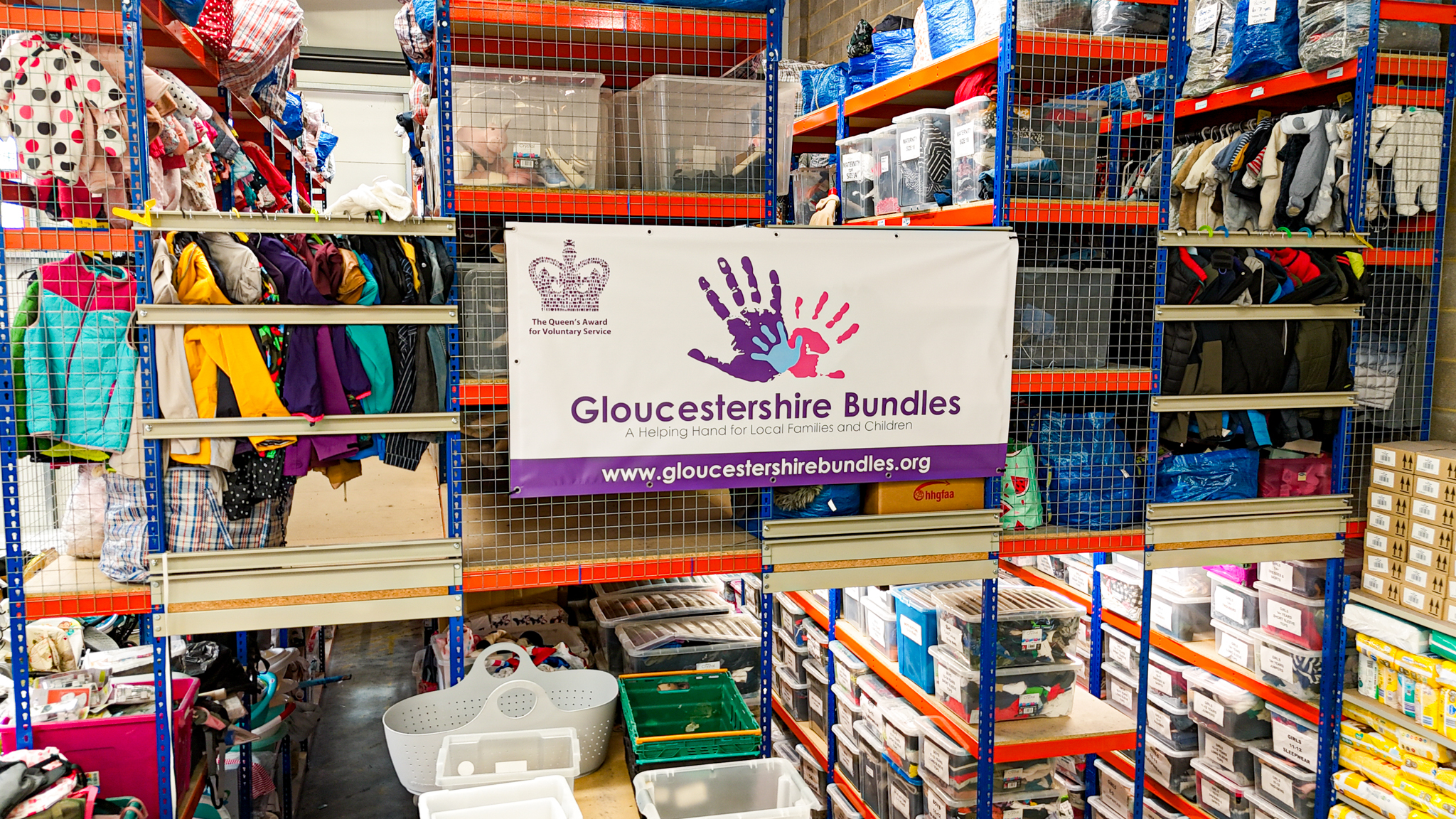
Union is the operations system I'm building for Gloucestershire Bundles, a local charity that gives bundles of essential goods (baby supplies, clothing, equipment) to families in need. Families don't apply directly. A frontline professional who already knows the family (a social worker, midwife, health visitor, or support worker) submits a referral on their behalf, and a small volunteer team reviews each one, prepares the bundle, and books a collection slot. I'm IT trustee on Bundles' board, which is the quiet way of saying the IT department is one person with a day job.
Before Union, that pipeline ran on a spreadsheet, an email inbox, a paper PDF form, and a wall calendar. The "current state" of a referral lived in whichever volunteer's head had touched it last. A decision agreed in a Tuesday email thread was invisible to the volunteer picking up the case on Friday. Paper forms got re-keyed into the spreadsheet, with errors creeping in at every transcription, and the same family could be referred by two professionals weeks apart and quietly receive two bundles when they should have received one with follow-up. Nobody could answer "how many did we do this month" without an afternoon of spreadsheet archaeology.
The brief wasn't "digitise the spreadsheet." It was: build something that holds the workflow together so the team can spend their time on the families, not the admin.
What it does
Three connected views sitting on one data model.
The professional portal is where referrers submit on behalf of a family. Household details, the reason for referring, each adult and child including ages and clothing sizes, anything urgent. Drafts auto-save as they go; submitted referrals show their progress through the pipeline; structured feedback comes back if a volunteer rejects or asks for changes; collection slots get booked here once the bundle is ready.
The volunteer portal is the triage and operations surface. A queue of incoming referrals showing what state each is in, who's ready to collect, who missed a slot, who needs another look. Detail views show the family's composition, classification, history, and any prior referrals from the same household. Volunteers approve, reject (with structured per-field reasons), classify, comment, @-mention each other, and confirm collections.
The admin settings are configuration without code: operating hours, blocked slots, the item catalogue, referral rules. The volunteer leads change these themselves.
The form is the on-ramp; the queue is the product
The first instinct on a project like this is to obsess over the form. The form is the only thing the people sponsoring the work can really picture, and obsessing over it produces clean wireframes that show well in stakeholder reviews. Most of the design effort actually went into the triage surface: what a volunteer sees in the first second of opening a referral, and how fast they can move to the next one. A people-table with expandable rows. A property strip showing status, urgency, and the next action above the fold. Inline classification edits with optimistic UI so the volunteer never waits for a round-trip.
The form is a one-time on-ramp. The queue is where the team lives.
Things the first version got wrong
The first cut had an assigned_to column on every referral. It modelled how I assumed the work happened and didn't match reality. Charity work is collaborative; three or four volunteers might touch one referral, each contributing a piece (initial review, classification, item prep, collection). Single ownership was always wrong. The replacement is @mentions in comments plus a watcher-style notification model. People opt into involvement; nobody is the sole owner of a case.
The other thing I got wrong on the first try was rejections. Early designs had a single rejection-note text field. It looked simple and it was. It also produced rejections like "the postcode is wrong, also the second child's age looks off, also we need a clothing size for the eldest," and resubmissions where the professional fixed two of the three and the third silently disappeared. Rejections became structured: each reason attaches to a specific entity (the referral as a whole, an adult, a child) and optionally a specific field, and the resubmission flow walks the professional through each one in turn. Same data; very different conversation.
Audit as a first-class surface
Every state change writes a structured audit entry. The volunteer "timeline" view merges audit entries with threaded comments and shows them as one chronological feed. This isn't a compliance feature bolted on at the end; it's how the team builds shared context. When a volunteer picks up a case three days into its life, the timeline tells them what's happened and what was said, without anyone having to forward an email.
I added the audit log late and regretted it. Retrofitting structured logging into the mutation paths was a long week of touching things that already worked. On the next project of this shape it goes in on day one, behind a single execution path that every state change routes through.
The donations problem
Inventory turned out to be the harder half of the system. Bundles takes donations in unpredictably: a hundred onesies one week, three pushchairs the next, a crate of clean blankets after that. The system has to know what's available when a referral comes in, in terms granular enough to match a family's actual needs. A single "item" isn't really a single thing. It's a batch, classified by what it is, who can use it, and what condition it's in.
The naive version (one row per donated item, flat list) collapsed inside a month of real pilot data. The shape that's emerging is batch-based storage with multi-classification on each item: a donated cot can be "sleep" and "0–2 years" and "requires assembly" without being forced into a single hierarchy. Getting the schema right now is cheaper than rewriting half the queue in six months when the data outgrows it.
What user testing changed
Drafts on the intake form turned out to be non-negotiable. Four steps, up to forty fields if a family has multiple children, professionals interrupted constantly. The first version had no draft state, and the largest source of friction in the pilot was abandoned forms. Auto-save on every step advance, a "Save & exit" button on every screen, a Drafts tab on the professional's home page, a 60-day retention window. None of that was in v1; adding it later was the single biggest reduction in abandoned referrals.
A family missing a collection slot turned out to be a permanent marker, not a transient one. The referral itself can recover; the family rebooks, collects successfully, the workflow continues. But the fact that they missed a slot is a signal volunteers want to keep seeing forever, even after the case closes successfully. The data model carries a has_missed_collection flag that's set once and never reset; in the UI it's a small icon on the queue row plus a banner on the detail view. Small change, large effect on where the team's attention goes the next morning.
Resubmission is its own state, not just "pending again." A referral that was rejected, fixed by the professional, and resubmitted is technically pending. For the volunteer, it isn't a fresh case; it's a returning one with context. The queue surfaces resubmissions with a small badge and the detail view carries the prior rejection reasons inline, so the volunteer can confirm each one is addressed. Without that signal, returning referrals get triaged as if they're brand new and the original feedback gets lost.
Where it is now
Union is in production with Bundles. Active work is on dashboard analytics, throughput reporting, automated reminders for unbooked or upcoming collections, and a printable referral export for offline handover. The longer-term direction is helping the team see the patterns the spreadsheet era hid completely: repeat families, collection delays, capacity bottlenecks, seasonal demand.
Public release to all volunteers and partner professionals is on track for late August or early September. After that, the most honest case study can replace this one.
What didn't work
errata- #1
One dialog for every status change. Approving, rejecting, marking collected, and archiving each have different needs: a one-click confirm, a structured form, an optional photo, a required reason. The first version tried to fit all four into a single dialog. The simple cases became ceremonial and the complex ones cramped. The split that earned its keep: a confirm popover for simple transitions, a dedicated dialog for the complex ones.
- #2
Filter chips at the top of the queue. The first version had a row of preset filters (Pending, Approved, Rejected, Ready, Collected, Archived) and assumed the team would scan by status. They didn't. Volunteers didn't think 'show me the rejected ones'; they thought 'show me what still needs work' versus 'show me what's done.' Replaced with a two-tab Queue / History split. Small code change, much better fit for how the team actually scans the morning.
- #3
Desktop-first triage. Internal tool, internal team. Desktop made sense. Then it turned out frontline professionals submit referrals between visits, in cars, in waiting rooms, on phones, and volunteers triage on lunch breaks, on phones. Touch targets came up to 44px, hover tooltips became tap-triggered popovers, every input had to be reachable above an iOS keyboard, and iOS safe-area insets ended up in every fixed bar.